By David Dawson
ddawson@tnbaptist.org
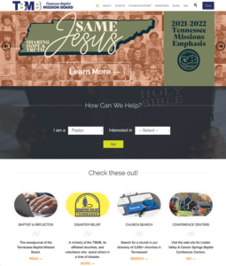
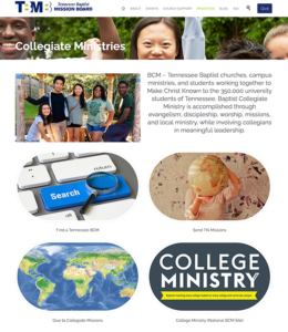
FRANKLIN — Those who are paying attention might have noticed that the Tennessee Baptist Mission Board’s website has a new look.
Actually, even those who aren’t paying close attention probably noticed. It’s kind of hard to miss.
With the goal of making the site more user friendly and ascetically pleasing, the TBMB unveiled the redesign last month.
“I am excited about offering Tennessee Baptists a website that serves as a resource to help them reach their communities and hopefully the nations for Christ,” said Chris Turner, director of communications for the TBMB. “Our entire existence is to make Christ known by serving churches. The site will continue offering resources that will help them be successful.”
Initially launched in 1998, the TBMB website has continually been restructured, upgraded and expanded through the years. But the latest changes — a project that has been in the works for more than a year — might be the biggest change yet.
TBMB media specialist Mike Salva was the “behind-the-scenes” catalyst for the redesign, and spent countless hours turning the project into a reality.
“I like the new site because it relies a lot more on visual elements, rather than a lot of text,” Salva said. “When the average user is looking at web pages or social media posts, they’re far more likely to pay attention to text content with images, rather than simply text. I also like the new site’s layout when it comes to presenting the events calendar, blog posts and media files.”
The newly-designed site is WordPress-based, and now features more room for a wider variety of site layouts than previous versions of the site. It also features a “How Can We Help” section that has dropdown menus designed to steer most new users where they need to go.
“We have been working on a redesign of the website for quite some time and encountered a number of complications through that time,” said Turner, “but we were determined to bring about change because the old site didn’t serve Tennessee Baptists or TBMB in the most effective way. Sometimes you’ve got to push through the obstacles to get to the change we knew we needed.”
When first launched more than two decades ago, the TBMB website was built on software that is now mostly obsolete, but the site has undergone a host of changes — some subtle, some obvious — through the years. Salva said one of the main goals with the most recent redesign was to create a website that was easy to use on all devices.
“We were interested in launching a new site that is more mobile-friendly, with fewer pages, less text, and more visuals to catch the user’s attention,” said Salva. “Rather than making the user have to read a lot of content, we were more interested in helping people find what they need by getting them in touch with the right TBMB staffers who are ready to help churches meet their needs.”
The TBMB website is considered a central component of the TBMB’s accessibility. It is used to disseminate information, promote the TBMB’s objectives and — perhaps most importantly — help Tennessee Baptists stay connected from across the world.
The site has had more than 12 million visits in its 20-year run, and has received accolades for its design and functionality.
With the recent changes, Turner said he feels the website is simply “better than it’s ever been.”
“We are excited and pleased with how it turned out,” he said. “We know from user traffic that events are hugely important to our users and we needed a way to improve delivery of information so they can better understand the value of camps and events.
“We believe we have accomplished that goal,” Turner said. B&R


